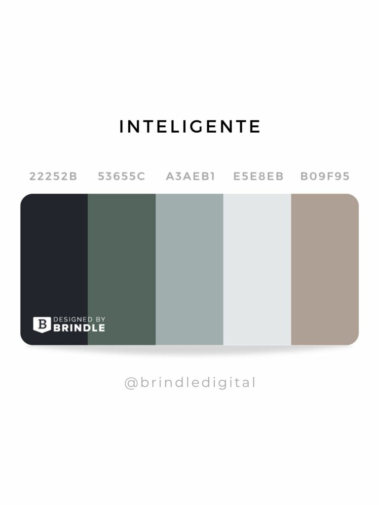
The Psychology of Color: How to Choose the Right Palette for Your Website
The psychology of color plays a crucial role in web design, influencing user behavior and perceptions. Different colors evoke distinct emotions and associations, which can significantly affect how visitors interact with your site. For instance, blue often conveys trust and professionalism, making it an ideal choice for corporate websites, while green represents growth and harmony, perfect for eco-friendly brands. Before choosing a color palette, consider your target audience and the message you want to convey.
When selecting colors for your website, it's essential to create a cohesive palette that enhances the user experience. A well-balanced palette typically includes:
- Primary color: The dominant color that reflects your brand personality
- Secondary color: A complementary color that adds visual interest
- Accent color: A vibrant hue used for call-to-action buttons and highlights
10 Essential Tips for Crafting Irresistible Color Schemes
When it comes to crafting irresistible color schemes, understanding the emotional impact of colors is crucial. Different colors evoke different feelings; for instance, warm colors like red and orange can create a sense of urgency, while cool colors like blue and green often convey calm and tranquility. To help you create harmonious and appealing palettes, consider the following 10 essential tips:
- Study color theory to understand the relationships between colors.
- Use a color wheel to identify complementary and analogous colors.
- Limit your palette to three primary colors for simplicity.
- Experiment with different shades and tints to enhance depth.
- Consider the context of your design to ensure the colors fit your message.
The next five tips will take your color scheme to the next level. Firstly, think about accessibility; ensuring that your color choices are friendly to all viewers is crucial. Secondly, utilize tools like Adobe Color or Coolors to generate palettes effortlessly.Thirdly, examine your competitors' color schemes for inspiration while ensuring your palette remains unique. Fourthly, trust your instincts—sometimes the best color combinations arise from intuition. Finally, seek feedback from peers or your audience to finetune your choices. By incorporating these strategies, you'll not only craft breathtaking designs but also engage your audience more effectively.
What Colors Work Best Together? A Guide to Harmonious Website Palettes
Choosing the right colors for your website is crucial to creating a visually appealing and user-friendly experience. A well-thought-out color palette not only enhances aesthetic appeal but also plays a significant role in user engagement and retention. Some of the best combinations include complementary colors, which are opposite each other on the color wheel, such as blue and orange or red and green. These combinations create a vibrant look that draws attention. Alternatively, analogous colors, which are next to each other on the wheel, like blue, green, and teal, provide a more harmonious and soothing effect that is easier on the eyes.
When selecting colors, consider the psychological implications they carry. For instance, blue is often associated with trust and professionalism, making it suitable for corporate websites, while yellow can evoke feelings of happiness and energy, perfect for creative portfolios. Utilizing a monochromatic scheme, where different shades of a single color are used, can also create a sophisticated and cohesive look. Additionally, incorporating neutral colors like white, gray, or beige as background colors can help highlight your main color choice without overwhelming the viewer. Keeping these principles in mind will guide you toward a balanced and visually striking website palette.
