AIM Uncovered
Exploring the latest insights and trends in technology and innovation.
Type This Not That: Web Typography Tricks You Need to Know
Unlock the secrets of web typography! Discover essential tips to elevate your design and engage your audience—don't miss out!
5 Common Typography Mistakes to Avoid in Web Design
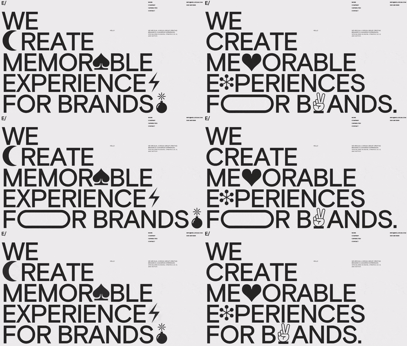
Typography plays a crucial role in web design, yet many designers fall into common pitfalls that can undermine the effectiveness of their layouts. One of the most prevalent mistakes is using too many fonts. While it might be tempting to showcase creativity with a variety of typefaces, this can lead to a cluttered and confusing experience for users. Instead, stick to two or three complementary fonts across your site to maintain visual consistency. Hierarchy is another vital aspect; failing to establish a clear hierarchy can make it difficult for visitors to navigate your content, resulting in a frustrating user experience.
Another common typography mistake is poor line spacing, or leading. Insufficient spacing between lines can make text hard to read, especially on smaller screens. Aim for a line height that is about 1.5 times the font size to improve readability. Moreover, many designers overlook the importance of font size; using font sizes that are too small can deter visitors from engaging with your content. Finally, neglecting to optimize typography for mobile devices is a significant error; ensure that your typography scales well across different screen sizes to enhance the user experience.

How to Choose the Right Font Pairings for Your Website
Choosing the right font pairings for your website is crucial for establishing a strong visual identity and enhancing readability. Start by considering the tone and message of your brand. For instance, if you aim for a modern and clean aesthetic, serif and sans-serif combinations often work well together. Additionally, contrast is key; pairing a bold, decorative font with a simple, understated one can create a pleasing visual hierarchy that guides the reader's attention where it’s needed most.
Another important factor to consider is legibility. While it's tempting to choose stylish fonts, they should also be easy to read across different devices and screen sizes. To find harmonious font pairings, experiment with tools like FontPair or Google Fonts, which offer curated combinations tailored for various design needs. Finally, test your selections by viewing them in context on your website, ensuring that they not only look good together but also maintain accessibility standards for all users.
Why Web Typography Matters: The Impact on User Experience
Web typography plays a crucial role in shaping user experience, as it directly influences how content is read and interpreted on a website. Effective typography not only enhances the visual appeal of your content but also aids in readability and comprehension. According to Smashing Magazine, a well-chosen font can significantly impact the time users spend on a page and their likelihood of returning. By prioritizing typographic hierarchy, such as using different font sizes and weights to guide readers through your content, you can create a more engaging and accessible experience.
Additionally, typography influences brand perception and user trust. A study by Nielsen Norman Group highlights how typography can evoke specific emotions and attitudes towards a brand. For instance, using clean and modern fonts can convey professionalism, while playful fonts might indicate creativity and friendliness. Therefore, choosing the right typography is not just about aesthetics; it’s a strategic decision that can enhance user engagement and foster a deeper connection with your audience.