Understanding the Basics of Responsive Web Design: Key Principles Explained
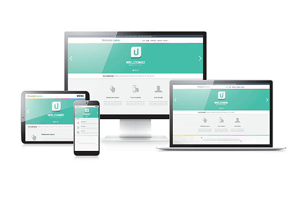
Responsive Web Design (RWD) is an essential approach to web development that ensures your website provides an optimal viewing experience across a wide range of devices, from desktop computers to mobile phones. The key principles of RWD include flexible grids, flexible images, and media queries. By utilizing a flexible grid system, designers can create layouts that adjust accordingly to different screen sizes. Furthermore, flexible images can scale within their containing elements, preventing overflow and ensuring that your site looks great no matter what device it's viewed on.
Another crucial aspect of responsive web design is the use of media queries. These CSS techniques allow your website to apply different styling rules based on device characteristics, such as screen width or resolution. For instance, you might want to switch the layout from a multi-column format on a desktop to a single column on a mobile device, enhancing readability. Understanding these foundational principles is vital for creating user-friendly websites. To delve deeper into media queries and their applications, check out MDN Web Docs.
The Benefits of Responsive Web Design: Why Flexibility is Essential for Modern Websites
Responsive web design is paramount in today's digital landscape, where users access websites from a myriad of devices, including smartphones, tablets, and desktop computers. The ability of a website to adapt seamlessly to different screen sizes and resolutions not only enhances user experience but also boosts search engine optimization (SEO). According to Smashing Magazine, having a responsive design can reduce bounce rates and increase the time users spend on a site, both of which are critical ranking factors for search engines like Google.
Furthermore, a flexible layout eliminates the need for multiple versions of a site, streamlining content management and ensuring consistency across platforms. This efficiency is essential for businesses aiming to deliver a cohesive brand experience. As highlighted by Web Designer Depot, responsive design can also improve loading times, which is increasingly important as users expect instantaneous results. In conclusion, adopting responsive web design is not just a trend, but a necessary strategy for maintaining relevance and competitiveness in the modern web ecosystem.
How to Achieve a Seamless User Experience Across Devices with Responsive Design
The era of digital engagement has made it imperative for websites to offer a seamless user experience across various devices. Responsive design plays a critical role in achieving this goal by allowing your website to adapt effortlessly to different screen sizes and resolutions. Implementing a responsive design ensures that whether a user accesses your site via a smartphone, tablet, or desktop, they receive an optimal viewing experience. To get started, consider employing flexible grids, images, and CSS media queries, which will adjust the layout based on the device's capabilities. For a deeper dive into responsive web design principles, check out this resource on Smashing Magazine.
To further enhance the user experience, it's crucial to prioritize loading speed and intuitive navigation across all devices. Slow-loading pages can lead to high bounce rates, so optimize images and streamline your site's code. Additionally, incorporating touch-friendly elements for mobile users, such as larger buttons and simplified menus, can significantly improve usability. Remember, user experience is not just about aesthetics; it's about functionality. For tips on optimizing user experience across multiple devices, refer to this insightful article from Nielsen Norman Group.